What makes a buyer decide to make a purchase? How can you as a business owner influence someone to choose your product over others? Let’s explore how successful business owners use a CTA, or call to action.
Think about the ways consumers decide to buy online. Some people know they need a product and they do research. They look at price, shipping fees, talk to friends, read reviews, look for FAQs on the product website, or chat with representatives of the company. Some consumers are impulse buyers. They respond to bright colors, bold text and how easy it is to buy the product. The impulse buyer has a feeling of sudden need and responds to certain cues on the site. Ever wonder why Amazon has one click buying? Anything that makes the buying process easy keeps customers coming back. What are the top ways of making a CTA successful?
Keep Your Site Simple

People like what they can understand. They want a clean design that is easy to follow, and therefore your CTAs should follow this principle. Let’s use the example of a button that says ORDER NOW. If that call to action is easy to spot on your page, using a larger font and a bright color, the customer sees it and takes the cue faster than if the CTA were a dense paragraph about why your product is the best. If you have a product that lends itself to repeat purchases and you hook consumers the first time, they will buy again and again because they know what’s involved.
Bottom line…never underestimate simplicity when designing your website.
Make Your Offer and Pricing Easy to Understand
People want to know how much something will cost them, yet are even willing to pay more for simplicity. A great example is the unlimited calling plan. It is so much easier to understand paying $50 a month with unlimited talk, text and data that many consumers would never take the time to research other plans, even if it could save them money. Limited plans come with restrictions and overage fees, so even if you as a customer probably would never go over that 3GB of data that could save you $20 a month, the possibility of the fee’s existence could make you choose the higher priced unlimited plan.
Shipping fees are another great example. A company that offers free shipping can charge more for the product because customers see free shipping and think they are getting something for nothing. Like the unlimited calling plan, they may not take the time to notice that this company’s price and shipping is actually lower than that company’s cost and free shipping. They want the deal and they want it now. This is just an example though, but one you can use in other areas of online business.
Bottom line…state your offer clearly and make pricing simple.
Fonts Send a Message to Customers
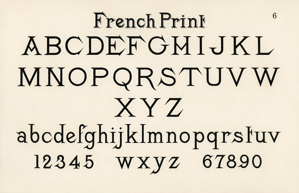
Fonts are underrated in the world of CTA’s. When you write a personal email, your choice of font is not important. Yet, when it comes to a CTA, your font needs to be easy to read, the proper size and not crowded onto the page to get the customer to notice your product. People subconsciously attach a difficult font to a negative perception of the product.
Another consideration is the image you are trying to present. Let’s use a classic font, such as Garamond, as an example. This font is clear and easy to read, making it seem a good choice for any business. However, psychology shows us that this font might work better for a financial institution than for a clothing line for millennials. You might use such a font to convey stability, trust, and loyalty, but not if you are trying to appeal to the consumer’s desire to be trendy.
Likewise, you could take a font that looks handwritten, such as Bradley Hand, and use it because it will be perceived as folksy, artsy or handmade. This kind of font would attract different customers than the above Garamond example, and you probably wouldn’t use it if you were selling tax services. Overused fonts can also bring a negative connotation. For instance, Comic Sans was once popular, but is now almost universally reviled.
Bottom line….pay attention to design trends, but be sure to choose a font that reinforces the message you want your product to convey.
Don’t Underestimate the Role Color Plays in Catching Your Customers

Possibly the most important decisions you will make for your business CTA’s involve color. Endless research has been conducted about marketing strategies involving color, for good reason–consumers are visual, and colors grab their attention, giving them cues they might not even be aware of. The feelings, moods, and image your brand creates are what persuades a customer to buy your product. Colors can match your brand’s personality or create dissonance for the customer.
Consider the fact that products marketed to men generally use rugged, darker colors, while products for women use softer pastel shades. Feminine hygiene products in a brown package would not resonate with women, while a glittery, purple home stereo system probably would not appeal to men.
Both sexes like the color blue, which might account for the fact that blue is popular as a logo, often seen as a color for dependability, trust, and security. Green is associated with the environment and eco-friendly brands, while simple colors such as black, white and burgundy tend to be associated with luxury and sophistication.
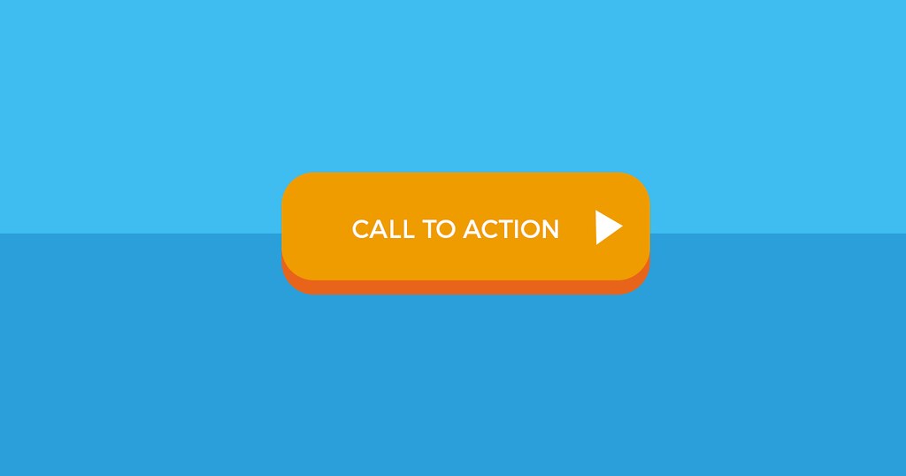
Red and orange are two of the best-understood color choices. Both of these colors make us respond with energy and urgency, which is why people use them for ‘Buy Now’ or ‘Sale’ graphics.
Bottom line…..think about color when designing your website and your CTA’s. It can make all the difference in catching consumers.
In short, you can improve your business by taking advantage of the psychology of marketing, making customers choose your product over countless others they could buy instead. By using colors and fonts strategically and making your information and pricing simple and easy to understand, you will have an advantage over the competition.